.
|
|||||
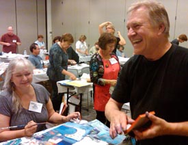
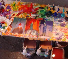
Last month’s newsletter highlighted our painting workshop in Italy. (Spectacular!) Arriving home, I juried our local Plein Air art show at the San Luis Obispo Art Center - the next day I was off to Wisconsin to Dillman’s Bay Resort and Creative Arts Foundation in Lac du Flambeau. A fabulous five day painting workshop with twenty-seven enthusiastic abstract painters. Back home for three days - long enough to unpack and repack for the Learning Product Expo in Pasadena - teaching seven different workshop subjects in four days.
Home again just long enough to pet the cats and get ready for a drive to the Mendocino Art Center for two weeks. The MAC is one of my favorite places to create my latest works! In these tough economic times, it is exhilarating for me to be in a packed room of twenty painters from all over the country. I’m doing two workshops at the Mendocino Art Center - three days of painting the undraped model, then next week it’s a “Larger & Looser” painting workshop with twenty-two more painters.
November is another fun-packed month of travel and workshops. Kate and I are making our annual trip to Raleigh for the Art of the Carolinas Event, sponsored by Jerry’s Artarama. My schedule is below in Workshops in the Spotlight - please join us! It’s a great way to end the year.
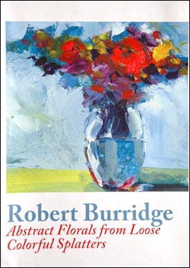
P.S. The autumn colors at Dillman’s in October were breathtaking to see - especially if you’re from California! The air was rainy and snowy - but I didn’t mind! I was experiencing seasons! If you’re looking for a quiet, very accommodating resort lodge workshop (plus fishing) go to their website - dillmans.com We are returning next August for painting and art marketing workshops. Product Spotlight Abstract Florals from Loose Colorful Splatters DVD (NEW)
Art of the Carolinas - It’s a great way to end the year! I have a full teaching schedule for Jerry’s Artarama Art of the Carolinas in Raleigh, North Carolina, November 12-15, 2009. It’s not too late to sign up and join the fun! Plus - you’ll learn a lot and get great discounts on art materials!
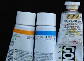
I am sponsored by Holbein for this Trade Show, meaning the paint and paper is supplied for all my workshops. What a deal! Bob’s Teaching Schedule: Our newest 3-hour class is “Loosen Up & Lighten Up the Rembrandt Way.” We explore different lighting techniques to achieve dramatic or subtle effects in your painting. We have a new studio chart on this subject!
My students talked me into producing this latest studio chart and I’m glad I obliged. The Rembrandt-Style Lighting Technique chart is a helpful, ready-to-hang guide for your studio. It clearly shows and graphically illustrates the need-to-know information pertaining to a dramatically LOUD painting or a quiet SOFT painting. Two types of light sources, the gray scale and color examples quickly remind you about lighting techniques that will improve your skills for producing successful paintings. It works for me - it’s simple and easy. Interested in dramatically improving your next painting? This new studio chart could get you there quickly! Click HERE for more of my workshops all over the county. Product Review
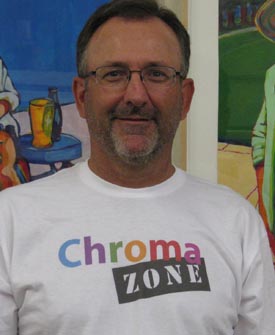
Mark Wood is a dear friend and a mover and shaker in the art world! We first met Mark at the Pasadena Trade Show in 2001 and by 2003 he had realized his dream of opening the Fine Artists Factory (FAF), a drawing and painting studio, to support fellow fine artists and to individually pursue his own fine art career. During the four years FAF was in Pasadena, Mark curated over 60 gallery exhibitions and hosted more than 20 workshops.
In addition to drawing and painting, Mark continues his entrepreneurial interests marketing “Pachyderms,” a custom built artist workstation and his new ArtTees designs, available at skreened.com/arttees
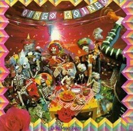
You can also reach Mark via his BLOG. Music of the Mounth More music! My taste in music is rather eclectic. In my studio and during workshops I play many different styles - classical, world, jazz, lounge… This month I thought it would be fun to delve into my favorite seasonal, Halloween-themed music. Those of you have have been in my workshops have probably heard some these. Enjoy!
Oingo Boingo
Outback
Incendio Ask Kate about Art Marketing
Bonnie from Wisconsin asks: What do you say on your resume when you are self taught? I have read everything I can on the subject and have done the trial and error (and still do) for over 12 years, full time, and am very good at what I do. I read other artists' statement, and it is chalk full of initials for everything they have accomplished? Then there is me, just a unrelenting artist who just will not give up. Sometimes I do not enter a show because the resume has to be displayed and mine seems quite boring next to others? Yes, I am embarrassed about this, but my work does speak for itself. Bonnie, thanks for this very honest question. I have printed your entire question because I’m sure that a lot of artists feel the same way - that if you are self-taught, you can’t compete with artists that have studied at an art school. First of all - whether you have a degree in Art or not, don’t let that stop you from pursuing your dream. I truly believe that it’s all how you present the information about yourself. In your case Bonnie, I would depart from a “business model” resume and insert photos of you working in your studio and photos of your paintings that have won awards or were featured in an exhibit. I would also recommend a brief, narrative “statement of purpose” or “Statement of intent” at the beginning of your resume. In that statement you could say something like this: “In the past fifteen years, I have explored watercolor, mixed media (yada yada yada)... lately my experimentation has taken me to work in (blah blah blah). After saying this, then I would do the resume list of exhibits, awards, bibliography, workshop instructors you have studied under, etc.
I also recommend the same resume model for artists that have attended a formal art school. In their narrative statement, they can talk about their education. The important thing to remember is that galleries do not really care if you have had formal art training or not - if they believe they can sell your work, they will want to represent you. Sales - that’s the bottom-line for galleries. If you have an art degree they will talk it up to their clients. If you are self-taught, they will talk THAT up to their clients! Initials and letters after your name are not all that important when it comes to selling your work. As a matter of fact, in our Art Marketing workshops, Bob and I always advise putting any society signature initials on the back - it’s just too distracting on the front. Your signature is more than enough and is among the more important things you can do to market your work! Thanks Bonnie - I hope this helps. I’ll get your Permission mug in the mail to you! For more info, click HERE to check out our Hot Art Marketing Workbook.
Breaking News We are teaching 2-day Art Marketing Workshops in Palm Springs, California and Springfield, Oregon next year: February 25-26, 2010 April 10-11, 2010 More News - Watch for our New Art Marketing DVD - Your Top Ten Burning Questions! Coming soon. For a list of my favorite books and magazines about marketing your art, click HERE.
Click HERE for top of page. |
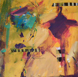
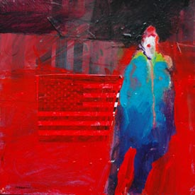
This continuing series spotlights successful color combinations using my Goof-Proof Color Wheel. This month’s step by step demo features Holbein’s Marigold as the dominant color (you can substitute a comparable red-yellow, tangerine, bronze, wheat, etc.). And that’s the point about my Goof-Proof Color Wheel Chart - any color close to my color wheel will work. In fact, when the dominant pointer falls on red - I pick out three different reddish colors. If I’m out of my specific “Flame Red,” I choose any red that’s close. As I often say, “This isn’t rocket science - it’s just water and color.” My color wheel simply gets you started quickly in a more successful direction. It works for me! •Marigold is the Dominant color
Step One: Bathe the canvas or paper with all kinds of wet, sloppy Marigold color (plus black and white if you wish). Make this step very playful and abstract. Pretend this will be your finished painting. Let dry.
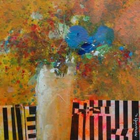
Step Two: The second color on the color wheel's spinner will point to the "Focal Point Color" - Compose Blue #2. Everything else in the painting will support this color. This is the focal point - the place you want the viewer to see first.
Step Three: The next two final colors I call “Spice Colors” and they only appear near and around the focal point color. As pure spice color around the pure focal point color the viewer’s attention is quickly drawn to the focal point. If you use any of these colors elsewhere in the painting you should “gray them down” so as not to draw too much attention to them… that is, away from the focal point.
I hope this series of my color combinations and compositions works out as a new inspirational start in your next series of paintings. Try them, copy them and then make them your own. You’ll be okay! For a detailed description of the Burridge Goof Proof Color Wheel, click HERE. Studio Tip
During some of my workshop demos, I use a paper towel and wipe a tinted, transparent color all over one of my dried, half-finished paintings. The result is usually a gasp, followed by “Oohs and Aahs” at the effect. Transparent watercolorists are masters of color tints, glazes, washes and staining colors… relying on the pure white of the paper to create the illusion of transparency. (A color wash will appear transparent, but a pure opaque color will appear solid.)
Depending on the manufacturer, every tube of color will indicate its transparency or opaqueness on the label. This is good to know if you either want to shift the overall color tone, or if you want to cover up an underlying color. Sure, opaque color can do the job.
I enjoy changing - in a flash - the painting’s color tone direction by wiping a transparent color over part or the whole painting. It creates a sort of “patina effect.” I like it! Combined later with pure color (your focal point) gives your painting added depth and interest.
Inspiration for Painting Everyday
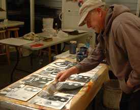
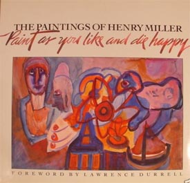
I am often asked how I paint everyday. How do I start and keep my enthusiasm up. My usual answer is, “Just show up.” It sounds like a smart-alecky answer, but actually it couldn’t be more true. Woody Allen said “90% of life is just showing up.” There are some days I feel uninspired, all painted-out, and just flat out tired. I drag myself to the studio and start by just looking around. I’ll have my coffee, read a book, write in my sketchbook - something to perk my interest up a bit. Invariably it happens and I get excited about a new project or a new technique I’ve been wanting to try. Sometimes all it takes is seeing a painting that I haven’t finished yet. So I begin my daily warmup paintings, all fired up! My inspiration comes from surprising sources. Henry Miller, the author, is the one that immediately comes to mind. Did you know he doodled in watercolor everyday before taking his meals while living in Big Sur? His library is on the Big Sur coast. Perusing his notes, I read that he painted for fifteen minutes everyday before dinner. He was lonely and it was a quiet place to be, so he painted and wrote daily.
An out of print book of his doodles is a rare and welcomed find - “Paint as you Like and Die Happy.” Henry Miller not only fills the pages with his whimsical style of calligraphy and drawings… he also writes about his time painting these little gems everyday.
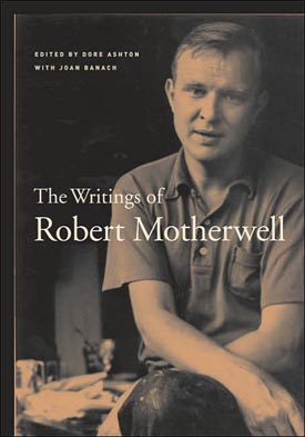
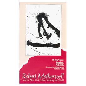
Robert Motherwell also painted everyday. Most importantly he painted on a ream (500 sheets) of white paper daily as a warmup exercise using large Sumi inked brushes. Think about that! 500 sheets, quickly painted with black marks and lines - everyday. He coined the phrase “Automatism.” In fact, he felt that painting everyday became so natural (like tying your shoe) that while painting, you are not thinking about what you are doing. It becomes automatic! Paint, at least fifteen minutes everyday! To read more about Automatism: For more information on Robert Motherwell and the other Abstract Expressionists, here is a wonderful VHS Video:
Robert Motherwell and the New York School: Storming the Citadel
Recommended Book
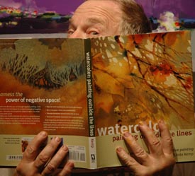
In my workshop classes when I talk about negative painting, I often get blank stares. (What is he talking about?) Even when I demo negative shape painting many students still don’t see it at first. The beautiful book, “Watercolor Painting Outside the Lines” by Linda Kemp will change your struggling time in the studio to an exhilarating, successful approach to your next masterpiece. This how-to book is a major, award-winning, internationally best seller that should be in every painter’s library. The principles clearly demonstrated throughout the book are true not only for watercolor painting - I use them for my acrylics and oils as well. Many of my students have attended Linda’s workshops and her classes at art expos and have raved about the beauty and originality of her paintings. No other instructor teaches her method of the power of negative space painting. Watercolor Painting Outside the Lines is fully packed with step-by-step techniques, an abundance of clear diagrams for color and design and Linda’s secrets for finding the negative space. I believe you will consider this book to be an eye and mind opening way to see as a true artist really sees and paints. Linda Kemp is internationally recognized for her unique contemporary watercolors and innovative use of negative painting and glazing. Her paintings and articles have been featured in American Artist, International Artist, Watercolor Magic, Watermedia Focus, Palette Magazine and The Watercolor Gazette. She frequently instructs and lectures at national symposiums and watercolor workshops throughout Canada, the United States and the United Kingdom. Watercolor Painting Outside the Lines Creating & Painting
•To do great work, don’t try to paint a good painting. Instead, paint a painting to show how interesting a painting can look to you. •In painting a new series, it’s less about where we stand as an artist... but more about in what direction we are moving. •When your painting starts to speak to you, don’t interrupt. •Don’t let others limit you because THEY can’t imagine doing it themselves. •Ask yourself, “What sort of painting would I make if I knew it would be great?”
Copyright ©2009 Robert Burridge. All rights reserved. Click HERE to sign up for the ArtsyFartsy News.
I have Facebook and MySpace pages set up! |
||||