.
|
|||||
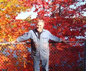
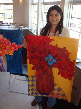
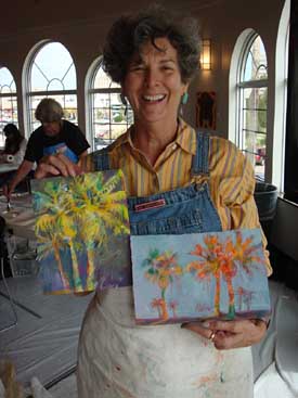
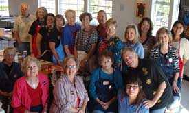
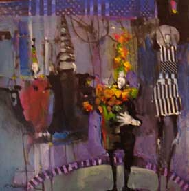
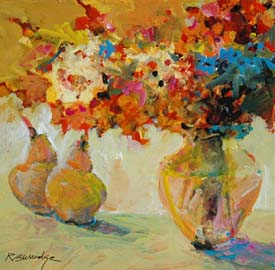
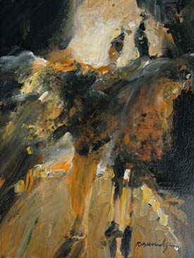
October was another travel month for me - Octo-blurr is how I refer to this month! I had some great times, visiting different locations across the country. I live in California on the central coast - we do not get this vivid fall color! This photo was taken at Dillman’s Bay Resort and Creative Arts Foundation at Lac du Flambeau, Wisconsin. Dillman’s Bay is a nostalgic resort on the shores of White Sand Lake. This classic vacation paradise offers a peninsula with full marina, tennis courts, playground, four beaches, picnic grounds and... creative workshops!
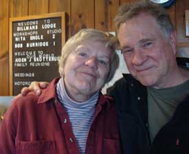
Nita Engle was at Dillman’s teaching the same week I was - our two groups celebrated her birthday one evening. Nita and I laughed a lot - she’s a real hoot and a living legend. She taught one of her famous watercolor courses, while I concentrated on abstract acrylic painting and collage.
Yes-- I will be back at Dillmans next year - Im scheduled for October 5-9, 2009. www.Dillmans.com
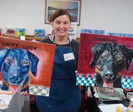
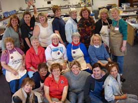
Here are a few candid shots from the week long workshop. For more workshop photos, check out our Workshop Photos section.
Product Spotlight BACK TO SCHOOL SPECIAL! Workshops in the Spotlight 2009 starts off with a bang! Our new Workshop season begins in Palm Desert, California at The Art Colony. I’ll be working in a mini-trade show atmosphere with full day and half day classes. We have another One Day Art Marketing Workshop planned in San Luis Obispo, California on Saturday, January 24, 2009. AND--- If you are looking for in-depth Art Marketing, our eight-week credit course starts at Allan Hancock College in Santa Maria, California on Tuesday, January 27, 2009. We meet weekly, on Tuesdays from 6:30-9:20 pm. Students can complete their portfolios along with pricing, inventory, photography, copyright, promotion during the time it takes to attend the course. Interested? www.HancockCollege.edu February is Florida Month!
February 9-12, 2009 February 16-20, 2009 My tour of the Gulf ends with a two day Abstract Floral Workshop:
February 21-22, 2009 For more of my workshops all over the county, check out my workshop schedule, www.RobertBurridge.com Recommended Book
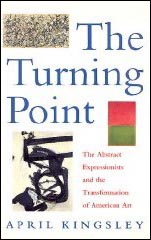
First published in 1992, this book is both biography and art history. My favorite. It is a detailed account and monthly report of what, when, who and why on the birth of American Abstract Expressionism. It is almost a daily account of the beginning of the "New York School," including Pollock, Rothko, Kline and Gottlieb, thru to Motherwell, Still, Reinhardt and everyone else who were in their studios at the end of World War Two. Artists were full of exhilaration and anxiety as they broke free from the exhausted European art community. Matisse and Picasso were still the "anointed ones." American artists were snubbed by the European old guard - so in typical American fashion, they started their own movement. It was around the time when I was born, 1943. Many of these artists felt a missionary’s zeal to reinvent what art should be. I am intrigued how they continued on with little or no money. Willem deKooning said, “We all had bad, hard times.” I like how Elaine deKooning explained it, recalling earlier times: “We never considered ourselves poor. We just didn’t have any money.” Considering our current economy, this may be a timely book. April Kingsley knew many of these artists personally. In her daily account, she interviewed every artist, spouse, friends and documented in detail, how and why they created their new art. I love this book and its history lesson. The Turning Point: The Abstract Expressionists and the Transformation of American Art by April Kingsley DVD Review
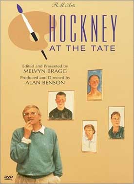
A few years ago we viewed the elaborate Hockney exhibit of paintings at the Los Angeles County Museum of Art. It was awesome! Huge paintings and a large variety of smaller portraits mesmerized us with his original point of view and paint handling. After exiting the exhibit, we went right back in again to look a second and a third time. I was also taken with the fact that David Hockney is alive today - a living master showing his work in a major museum. This DVD, David Hockney at the Tate, has Hockney walking around his major retrospective at the Tate, talking about his work. It is enlightening and delightful to listen to him discuss his work - from the earliest portrait of his father to his most recent work. How often do we get an opportunity like this? I was very much moved by this successful painter. A must-see DVD and a must-have if you are interested in hearing a master artist discuss and describe his work in person. Hockney at the Tate Product Review
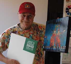
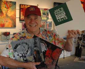
I’ve written about the Joe Miller Signature Extra Deep Gallery Wrap canvases and the Joe’s Prime Extra Deep Gallery Wrap as my new favorite canvases for all my 12 x 12 inch daily studio warmup exercises. I order them from the Cheap Joe’s Art Stuff catalog ‘cause they are cheap! However, when I travel to workshops or paint plein air, to save valuable space in my luggage, I paint on Joe’s Prime Canvas Panels.
These thin, super-sturdy, warp-resistant hardboard canvases are already gesso-primed and acid free. I prefer the three pack of 12x12 inch panels - and $4.99 for three canvases is an incredible deal in my book. They are so cheap - I also use these canvas panels for my daily warmups. And when the paintings are sold, they are priced “as a canvas” and not as a paper painting. Click HERE to check out the Prime Canvas Boards at Cheap Joe’s Online Catalog. Ask Kate about Art Marketing
Susan from Dallas, Georgia asks: What is the difference between a body of work and a series? Hi Susan, Thanks for the question! We refer to a body of work as a series - can be a big, evolved series. A body of work will feature one theme, one “big idea.” I will further explain by example... Bob’s has a theme that he has been working on for over ten years: The Good Life. Within his Good Life theme are many bodies of work - prepared for a gallery submission, an exhibit, a festival or an article in a magazine. A body of work will feature a cohesive “look” and that cohesiveness will communicate just what you want the viewer to know about your art.
Mia from Camarillo, California asks: It's frustrating! I've never advertised in newsletters or listed my awards and shows because I am the painter, the delivery and pickup person as well as the office girl who can cook. The PR "computer time" takes away from painting time. Should Artists in a similar situations spend the money to hire a P.R. person helper? What is the most economical way to get your name well known? Dear Mia, I can appreciate your frustration. Everyone is so busy these days that I am certain business and PR is probably the LAST thing you want to do - especially when all you really want to do is create your artwork! Special Note: We have updated the “How to Photo” Notes in our Hot Art Marketing Workbook. We collaborated with our pro photographer, Forrest Doud from San Luis Obispo. This new section includes more up-to-date info on taking digitals. If you would like to update your book with these notes, please send us $5.00 and a Self-Address Stamped Envelope (42-cent postage) Thank you! For more info, click HERE to check out our Hot Art Marketing Workbook. Thanks for asking Kate!
Click HERE for top of page. |
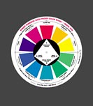
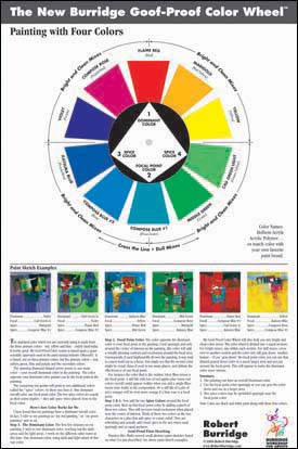
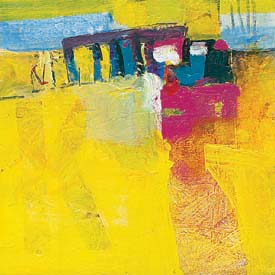
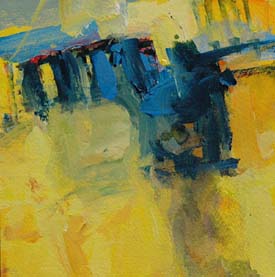
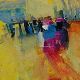
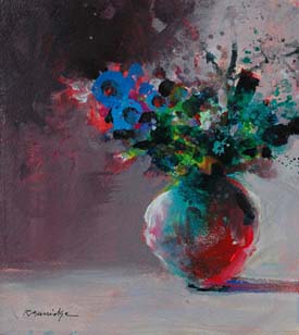
In the past monthly newsletters we featured the twelve designs and compositions found in a successful painting. Starting this month we begin a new section featuring successful color combinations using my Goof Proof Color Wheel. Many of you who utilize my Color Wheel are producing “sold” paintings - you have emailed me about your renewed self confidence and ease in painting. Great! It’s working! Thank you, thank you! So, in response to your requests, I begin this month featuring the first of ten color combinations that work for me.
•Yellow is the Dominant color Decide on a Color Combination and a Composition. Step One: I cover the entire canvas with various yellows. I do not use just one color yellow - Always a variety in my dominant color, plus white.
Step Two: Because I have already decided on my composition design, I place the focal point color right where I want the eye to go. Yes! Put the focal point down immediately and abstractly. It helps me early on in the painting to determine why I’m doing this painting in the first place.
Next, the two spice colors. These two colors "dance around" the focal point and are pure colors. If used elsewhere in the painting (and not around the focal point), I “gray down” the spice color to not draw attention to itself. To gray down a color, mix in a small amount of its complement. That way, I can create a colorful, yet neutralized version of that spice color. It helps to hold the painting together.
Repeat this exercise everyday in a series of at least three daily warmups. Think abstractly first. Remember, under every good painting is a good abstract painting. For a detailed description of the Burridge Goof Proof Color Wheel, click HERE. Try this Assignment
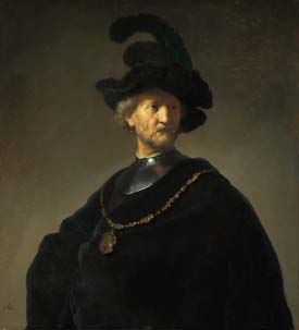
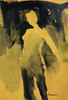
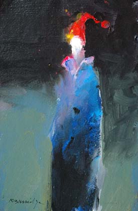
Staring at a Rembrandt painting awhile ago, I wondered what made his portraits so striking. Besides the obvious masterhand of rendering a likeness of the person, using limited palette of black, white and earthtones, it finally dawned on me. His dramatic use of strong graphic design and strong lighting. My eye went directly to the center of interest - the face - because it was the brightest section next to the darkest dark. (And how many years of painting did it take me to finally wake up?) So I made a sketch painting, emulating his theory and technique on an orange-toned paper, using only black acrylic paint:
• The background started black at the top and gradated down towards the bottom. • The figure was painted in the opposite direction. The bottom of the legs started out as the blackest black and gradated lighter as I moved up to the lightest part of the face.
I began an entire series like this … I experimented with different human forms, floral still lifes and even free abstract paintings. I practiced this simple concept over and over again with black and white warmups - then I switched over to a color palette, using this same technique. I’m hooked!
Many of my recent works, whether recognizable subjects or experimental abstracts continue with my recent “discovery.” In my workshops I invite the painters to copy this figure and paint a series of six. Their excitement of discovery prompted me to write this article and suggest you try the same exercise. Practicing this multiple series over and over again could help you produce more favorable and dramatic results. Practice, Practice, Practice! Even Arnold Palmer once said, “The more I practice, the luckier I get.” He continued on with this observation: “The days I don’t practice, the behinder I get.” I know the feeling. Studio Tip
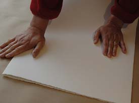
When I work on watercolor paper, I prefer Fabriano papers. I also prefer the paper edges deckeled - rough and unfinished. It adds a handcrafted quality to the finished painting. Having said that, when the full sheet is trimmed with a knife or cut with scissors however, I lose one or two of the deckel edges. That’s a problem! Solution: Tear the paper. The edges stay deckeled all around. The following is the approved, no nonsense way to tear paper. No special tools are required! (like those special “deckel edge metal rulers or serrated scissors)
For a standard size half sheet, fold the full sheet of watercolor paper in half. Press down on the crease with a roller, a hard tool or even the back of your brush handle. Make a hard crease.
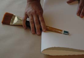
The secret to tearing paper is to fold the paper back the other way and press down on the crease again. The paper crease now becomes more flexible and easier to tear apart.
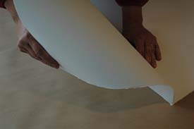
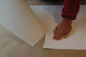
Now for the actual tearing - Hold and fold the paper as though you were making a paper cone. Starting at the top of the crease, make a small tear. Tear the paper AWAY from itself - do not tear it by pulling the paper towards you (it will tear diagonally) - tear it away from yourself. This will result in a beautiful deckel edge! Continue folding and tearing until you reach the size you want. A half sheet tears down to two standard quarter sheets and so on.
This technique works on both 140 lb and 300 lb paper, gessoed or non-gessoed. No need to wet the crease beforehand. More importantly, tear when the paper is completely dry and remember to tear the paper away from itself. Another Studio Tip
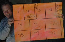
My small warmup paint sketches are not a standard size. They are, however, from cut-up watercolor paper. One standard 22 x 30 inch sheet yields ten paintings that are 6.5 x 9.5 inches.
Just think - that $7.00 Fabriano 300 lb watercolor paper is not expensive when it will possibly yield up to ten paintings which you will sell for much more than the cost of your paper! Add a Documounts mat , foam board back and a crystal clear bag for a great presentation. Music to Paint (and Move!) By
More music! My taste in music is rather eclectic. In my studio and during workshops I play many different styles - classical, world, jazz, lounge… Below are a few more of my favorites. •Grey Boy •World Groove Mix •Nightmares on Wax For more music, click HERE and it will take you to my favorite Workshop Music. We will post more favorites and new finds every month in our ArtsyFartsy News and on my website. We’ve separated them into categories to make it easier. Enjoy! Doctor Bob’s Advice Column
•Three words that will make your artist life much easier: •If you are feeling pressured before beginning your next painting. •“There are those who think they can ... •Who are the painters you admire? Past or present! Who do you admire the most? I guarantee you they were the “risk takers.” Producing good art is all risk taking, and risk taking is failure prone. Otherwise, it would be called, “sure-thing taking!”
Copyright ©2008 Robert Burridge. All rights reserved. Click HERE to sign up for the ArtsyFartsy News.
|
||||