.
|
|||||
|
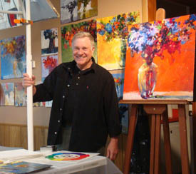
Welcome Back!
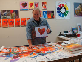
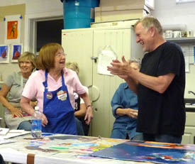
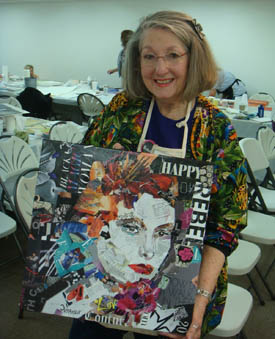
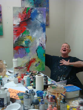
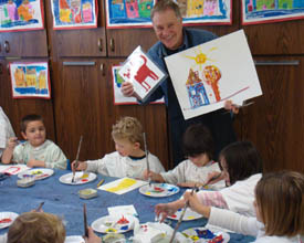
Three Week Tour... First workshop was in Sarasota, Florida at the Art Center Sarasota. A full house, plus a Sunday afternoon demo for an audience of 150. The Abstract Painting & Collage workshop was filled with 24 painters. I was very energized being surrounded by “my people.”
Of course, on Saturday after the workshop was over, I took a day off to visit the always inspirational Ringling Brothers Museum, which gave me even more inspiration for my continuing series of circus painting.
Next - off to Dallas, Texas to another full house of eager painters at The Artist Showplace. Art gallery and workshop space on two floors. I loved their Texas hospitality, accommodations and professionalism. They have raised the bar for artist-owned galleries - an excellent venue for the latest wave of future galleries. On Saturday I visited galleries in Dallas (I did my homework first).
Then - immediately flew to Pensacola, Florida for the last leg of my "tour". Twenty painters, organized by Joyce Bennink and Diane Goeller. This five day Abstract Painting workshop was well organized and very supportive to individuals’ needs. This was my third visit to Pensacola and understand they have already scheduled me for 2014. Wow, what a ride I’m on!
Workshop in San Miguel de Allende, Mexico
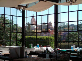
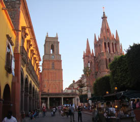
San Miguel de Allende - very picturesque and inspiring to paint! Johanna Morrell of Flying Colors put together a great experience for us. We stayed at the Posada de la Aldea Hotel, very close to the heart of the city. Our painting studio was a glassed-in room with amazing views of the colorful houses and church spires. We painted on location, ate wonderful meals at 5-star restaurants, visited artists’ studios and had our own art show at the end of the workshop.
Yes - we are going again! This is too good of a trip to pass up. Check out our San Miguel Trip photo album on Facebook. Click HERE for the public link.
Paint with Bob in San Miguel de Allende! More Great Trips! International Workshops - Please Join Us!
Painting in Tuscany!
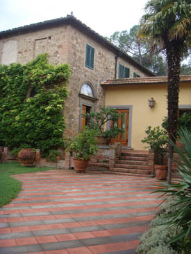
Villa Fattoria Bacio, in the heart of the Tuscan countryside. Between Sienna, Florence and San Gimignano sits the beautiful Villa Fattoria Bacio. The villa is the perfect blend of old world ‘rustica’ and catered comfort, surrounded on all sides by spectacular views of the meandering hills of Tuscany.
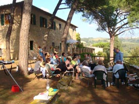
Seven nights lodging at the villa, nightly genuine Tuscan meals and fine wine are included. The five day workshop will take place Monday through Friday. We did this trip to Tuscany in 2009 - went to Florence for a few days before the workshop started - I highly recommend going to Florence at least once! Click HERE to view our Italy Trip photo album on Facebook. Contact Sedona Art Center (888) 954-4442 or (928) 282-3809 www.sedonaartscenter.com
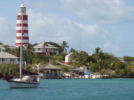
Paint with Bob in the Bahamas! Workshops in the Spotlight
Bend, Oregon Cloudcroft, New Mexico and... two 3-day workshops in July 20-22, 2011 Featured Product Special
New Online Special! Product Review
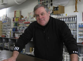
Black Horse Fine Art Supply - Many of my Workshop Students purchase their workshop materials from Black Horse. John E. Bates bends over backwards to make sure you get your order on time!
“Black Horse Fine Art Supply specializes in Mail Order and Retail Art Supplies, Art Marketing, Material Consultation and Art Material Kits for Professional Studios, Institutional Classrooms and Private Instruction. We offer Holbein Artist Materials, Golden Art Colors, Stratford & York Brushes, Strathmore Paper, Apollon Canvas and much more… What's news and exciting for Black Horse is that we are MOVING! Yes that's right! Moving back to Burlington and down near the waterfront in the heart of the Art District where there are 100s of artists’ studios. Other exciting news is that we are in the middle for building a brand new web site that we hope to have launched by spring that will continue to serve our national and international clients, and serve as a resource for all our customers everywhere. We are very excited to say the least!” Contact John for great deals! www.black-horse.com or (800) 790-2552. We Want to Hear From You!
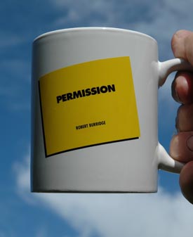
Keep those Studio Tips and your questions coming! If we use yours in an ArtsyFartsy Newsletter, we will send you a Burridge Permission Mug.
Susan from Georgia asks:
Dear Susan,
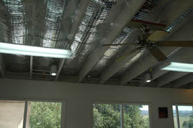
We also upgraded the studio while Bob was on his three week “tour” - we added new insulation material to the studio ceiling.
Very cool and high-tech looking! The material we used is “Enerflex” and is a highly reflective, double-sided, multilayered material. Really easy to install - reduces solar heat in the studio. And in cool weather, they say Enerflex helps prevent radiant energy from leaving the studio and reduces heat loss. Thanks for your question, Susan! We’ll send you a Permission Mug! Bob’s Studio Tip for Loosening Up
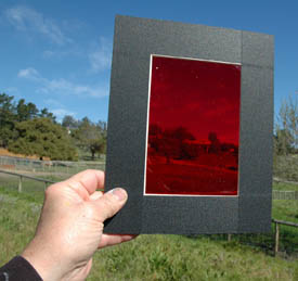
Helpful Red Viewers! Solution: Look at your painting through red (or green) colored Plexiglas. The painting colors disappear and instead you see only the contrast and shapes. This will help you know if you need more contrast and where.
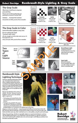
If you prefer a soft, gentle look, the painting will have little contrast and close values. If you want a dramatic painting, you will have strong contracts and distant values (think checkerboard). Refer to my Rembrandt-Style Lighting & Gray Scale Chart for understanding and explanation.
Rembrandt-Style Lighting Chart You can also buy colored Plexiglas viewers in art stores or quilting supply stores (Quilters use them for the same reason). You can even make your own viewer using red acetate - comes in thin plastic sheets you can cut with scissors, generally found in art or hobby stores. Do not use rubylith - it’s not optically clear. In the old days, smokey colored glass helped in the same way - popular during the Renaissance. Also, today a nice trick is switching your digital camera over to black & white mode. Look for directions in your camera’s manual.
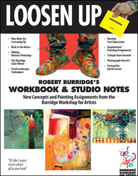
Just letting you know what all those little red things are sitting around my studio! I have more tips for loosening up! Check out my Loosen Up Studio Workbook for more techniques to help you stay loose, relaxed and creative!
Click here for product information. Ask Kate about Art Marketing
Shari from California asks: 1. Are discounts customary and is it usual to split the discount with the artist? Hi Shari,
Okay-answers to your questions! 2-3. Artist is responsible for shipping to the gallery. Gallery is responsible for shipping sold work to the customer or unsold work back to the artist. Again - put it in writing. 4. Ideally, I like to check in with our galleries every two weeks. Just to check in. It’s good to stay in touch to see if they need new work, tell them what new work is coming, talk about sales strategies, planning a solo show... it’s just good business and marketing on the part of the artist to keep the lines of communication open!
5. We always ask - and as a matter of fact, it is a law in California that the artists are entitled this info. Most galleries will not willingly part with this information. Put it in your contract. Click HERE for a great resource to Volunteer Lawyers for the Arts.
Click HERE for top of page.
|
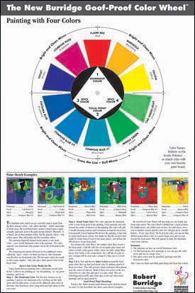
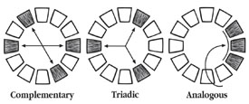
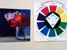
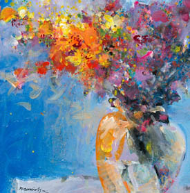
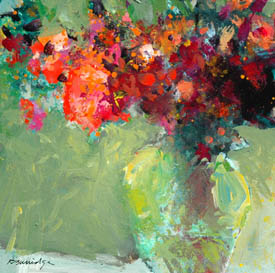
Color Wheel - Here are my Thoughts
The Reasoning Behind my Goof Proof Color Wheel The standard color wheel has twelve colors. I have followed its use, its color combinations for my work for many years. The standard color wheel helps painters decide which combinations to use - such as Monochromatic (one color plus black and white), Analogous (any three colors all touching each other, i.e. red, orange and yellow), Complementary (two colors directly opposite to each other such as red-green or violet-orange, etc., and Triadic (three colors - every fourth color on the color wheel - red, yellow, blue). There are more combinations but these are the basic ones.
When properly used, these combinations appear to have a visually pleasing effect. The painting will be bright, clean and crisp. If the combinations are mixed up, the painting will appear dull or muddy. That's how the standard color wheel works. I personally prefer bright paintings so I've stuck to the color "rules" since art school days.
My Goof-Proof Color Wheel was inspired and developed after reading up on the Munsell Color Theory. I wanted to paint with less colors and still have a visually powerful impact. I chose ten colors I happened to feel good about. Ten tubes of color were sitting on my painting table one morning - I must have been intuitively painting with those colors that week. Next, I arranged them in a circle and thought it almost looked like a wheel, but not exactly. Then, wanting to cut down my standard colors, I wanted to see for myself if I could discipline myself with the diamond-shaped spinner that only pointed to 4 colors to be used in each painting.
What I found surprising was an original combination I had never used before. Next, I had the idea of choosing one dominant color overall. In fact, I refer to my paintings as the "red one" or the "blue one", etc. Next, the color opposite the dominant color is what I call my focal point color. And the two remaining colors I call my "spice" colors when placed near the focal point color. They add an extra "spice" and highlight the focal point color. With this new thinking, I set out to paint loose sketches trying every spinner-pointed combination. I loved the results because I never knowingly or decidedly painted this way before. It was a different look for me. This discovery invigorated me and propelled my work to a fresher level.
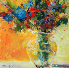
For me, the color combinations project and communicate a feeling I want to convey. I prefer light-hearted themes in my work so I choose "happy" colors. I am not a morose person, so therefore I don't do work that is dark or depressing. If I did, I would choose a combination of black, violet and dark green for instance. Primaries tend to be happy and cheerful. So, in conclusion, yes - color affects intended emotion. What's Up with Texture?
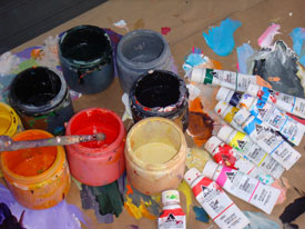
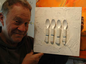
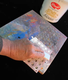
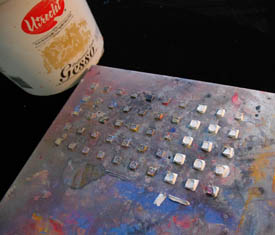
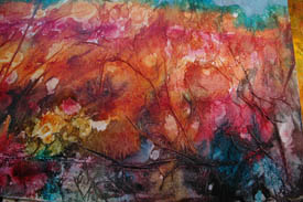
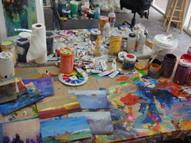
Let’s keep this simple. I like to touch. Texture is something that happens when I finger paint my large acrylics. It’s a visceral thing. However, there are other times I gouge a purposeful textured pattern in the substrate. I trowel on a thick amount of Utrecht Professional gesso. Other famous brand names have their own similarly thick gesso. Try them all!
While the gesso is still fresh, I draw in it with a stick or smush the gesso around. Remember - it’s playtime! I’m going for texture that doesn’t draw too much attention, but lets everyone know she’s around. Texture is not my primary medium. For me, texture is an added surprise, fun dimension. It adds visual appeal when appropriate. Texture, just for textures’ sake does not speak to me. I still look for what the artist is saying. Here are just a few texture techniques that work for me:
•Thick gesso squeegeed over a rubber kitchen sink mat. Lift the mat and you have a checkerboard pattern of 1/8 inch squares. Let dry. Or spray water to reshape and then let dry.
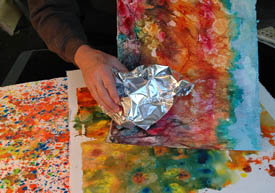
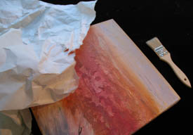
•Press plastic wrap, wax paper, aluminum foil, etc. into wet or damp paint to create random wrinkles and patterns. Remove after completely dried.
•Collage tissue paper, rice paper, etc., with gel medium.
•Isopropyl alcohol (rubbing alcohol) 71% or higher from drugstores. Splash on very wet painted surfaces. Does not work on think paint or dried surfaces. DO NOT use a mister. Texture! Now go paint! Recommended Book
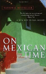
Before teaching in San Miguel de Allende last month, I read these books about the area. I appreciate more of what I’m looking at when I know a little history. Tony Cohan’s On Mexican Time is more than just a travelogue - but for those of us wanting a simpler, yet different way of life. After reading, you may start packing your bags! What Peter Mayle has done for Provence Cohan’s expatriate observations may lure you to another paradise.
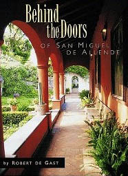
On Mexican Time: A New Life in San Miguel by Tony Cohan Behind the Doors of San Miguel de Allende by photographer Robert de Gast is a small but stunning visual book of ninety-six superb photographs. The images are what most visitors seldom see. It’s a “house & garden tour” of patios, inner courtyards and private spaces. You may not want to knock on those huge doors (with knockers) but this guy did it for you!
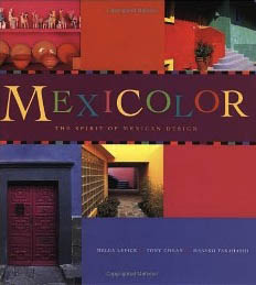
Behind the Doors of San Miguel de Allende by Robert de Gast Mexicolor, the spirit of Mexican Design is a collaboration of Tony Cohan, Masako Takahashi and photographer Melba Levick. This 12x12 inch book will stay on your coffee table. It is a visual feast of Mexican culture and all that is brilliantly beautiful. Picturesque colonial towns, villages, beaches artisan homes to bold, contemporary interiors, open markets, textiles, ceramics and folk art explode within these pages. This book continues to nudge me toward Mexico and the people... I love this book - especially the color!
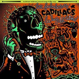
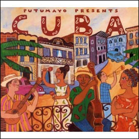
Mexicolor: the Spirit of Mexican Design by Tony Cohan, Masako Takahashi and Melba Levick Music to Paint By! - All Latin... all the time!
Luz del Ritma by Los Fabulosos Cadillacs
Putumayo Presents Cuba An Alternative to Gesso
Great Results But.... In one of my most recent workshops I noticed a painter priming her paper not with acrylic gesso, which I use, but instead smearing on a coat of Venetian Plaster. Huh? That was her ground before painting with her acrylics. The results were stunning. I was stopped in my tracks when I saw her landscapes. Got back to my studio, went online to research it. This is what I found. I checked Amien.org (Art Materials and Education Network) - the staff is the ICA Art Conservation - America’s oldest regional art conservation center. Here is what they said: Don’t. It is considered “house paint category” and might last only ten years. Who knows about your artwork after that? This group is fabulous. They explain the facts and answer questions extremely well. They know what they’re talking about! Use them next time you have a technical paint situation. www.amien.org Register for their forums then you will have access to tons of information. Inspiration
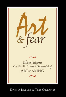
You lost that lovin’ feeling…? That connection with that wave of creative painting that you were once into? You feel empty? I have found myself in a similar place several times during my twenty-plus years of painting everyday. There are many books on this exact subject. One of which, I highly recommend, “Art & Fear.” Sections of this book deal with the artist’s downtime. Info for the book Art & Fear will be at the end of this article. Initially, when I was “painted out,” and there was nothing more inside of me, I panicked. Searching and reading the bios of other painters’ lives, I was slightly relieved that others managed to move past these moments. Here is what I’ve learned.
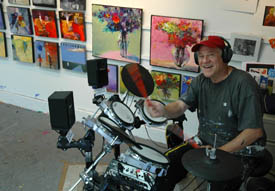
First, recognize that the feeling of “no fire in the belly.” Then - breathe. You haven’t lost the drive and desire. you just need some down time away from your creative studio. I do non-painting stuff like beach walks, farm chores or drum.
I have noticed I feel burnt out exactly the day after a solo show, or an art festival or my museum exhibition. I’ve since have learned I was “painted out” - I gave it my all! Nothing left. Technically, I needed to recharge my batteries. I began first by taking extra good care of myself. You know - haircuts, massages, reorganizing my clothes, cleaning up the studio, drumming. While I am doing something different from my art, I justify to myself that I’m not procrastinating… I’m percolating! And it feels true!
A few days after, I’m a different, more energized person. Ready to go and continue painting where I left off or begin a new body of work I’ve been wanting to do. I’m fresher, refocused and I have a new goal.
I should tell you, I’m very goal oriented. During my down time I journal like crazy. (therapy?) In my daily journals I empty my head of “mind chatter,” yesterday stuff, tomorrow stuff and I focus on today’s goals. I get great satisfaction and a sense of accomplishment crossing them off. I don’t delete my “things to do,” I need to see and measure what I’ve done by the end of the day. It has been pointed out to me the similarities of a body of work for several months, having the exhibition, then followed by depression resembles being pregnant and giving birth, followed by postpartum depression. Well, I’m a guy so I’ll never know the excellent fortune and joy of giving birth, but thank you for the thought. And I think they’re right! You work for months on a BODY of work and them BAM! an exhibition opens with your new body of work. Next day, depression. It’s over. You gave it your all. There’s no more left. This is exhaustion and fear all mixed up. Rest. Breathe. Do Something Different. No Art. Time Off. Down Time. Me Time. Plant Anything.
In a few days (or months) you’ll be new again. Stay focused on your goals and your groove comes on. Groovy! Don’t Forget - This is a Great Book!
Art & Fear: Observations On the Perils (and Rewards) of Artmaking by David Bayles and Ted Orland
Copyright ©2011 Robert Burridge. All rights reserved.
For Email Marketing you can trust
I’m on Facebook!
Sign in to be my friend. Why, I even Twitter!
Recommended Facebook Fan Pages:
|
||||