close window  The Reasoning Behind my Goof Proof Color Wheel
|
|
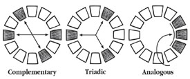
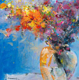
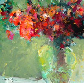
The standard color wheel has twelve colors. I have followed its use, its color combinations for my work for many years. The standard color wheel helps painters decide which combinations to use - such as Monochromatic (one color plus black and white), Analogous (any three colors all touching each other, i.e. red, orange and yellow), Complementary (two colors directly opposite to each other such as red-green or violet-orange, etc., and Triadic (three colors - every fourth color on the color wheel - red, yellow, blue). There are more combinations but these are the basic ones.
When properly used, these combinations appear to have a visually pleasing effect. The painting will be bright, clean and crisp. If the combinations are mixed up, the painting will appear dull or muddy. That's how the standard color wheel works. I personally prefer bright paintings so I've stuck to the color "rules" since art school days.
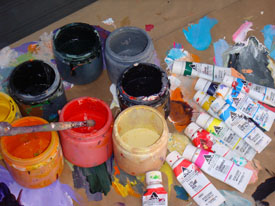
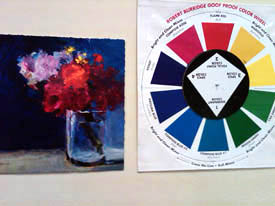
My Goof-Proof Color Wheel was inspired and developed after reading up on the Munsell Color Theory. I wanted to paint with less colors and still have a visually powerful impact. I chose ten colors I happened to feel good about. Ten tubes of color were sitting on my painting table one morning - I must have been intuitively painting with those colors that week. Next, I arranged them in a circle and thought it almost looked like a wheel, but not exactly. Then, wanting to cut down my standard colors, I wanted to see for myself if I could discipline myself with the diamond-shaped spinner that only pointed to 4 colors to be used in each painting.
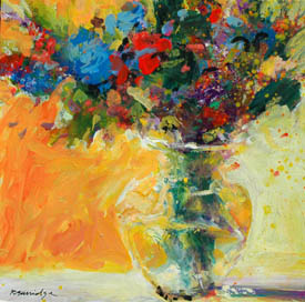
What I found surprising was an original combination I had never used before. Next, I had the idea of choosing one dominant color overall. In fact, I refer to my paintings as the "red one" or the "blue one", etc. Next, the color opposite the dominant color is what I call my focal point color. And the two remaining colors I call my "spice" colors when placed near the focal point color. They add an extra "spice" and highlight the focal point color. With this new thinking, I set out to paint loose sketches trying every spinner-pointed combination. I loved the results because I never knowingly or decidedly painted this way before. It was a different look for me. This discovery invigorated me and propelled my work to a fresher level.
For me, the color combinations project and communicate a feeling I want to convey. I prefer light-hearted themes in my work so I choose "happy" colors. I am not a morose person, so therefore I don't do work that is dark or depressing. If I did, I would choose a combination of black, violet and dark green for instance. Primaries tend to be happy and cheerful. So, in conclusion, yes - color affects intended emotion. |
Copyright ©2011 Robert Burridge. All rights reserved.
If you wish to copy this material to other publications
or mail lists, please ask for permission by contacting:
Robert Burridge Studio
Arroyo Grande, California
805-459-1503
rburridge@robertburridge.com
www.robertburridge.com
close window