.
|
|||||
|
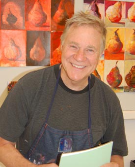
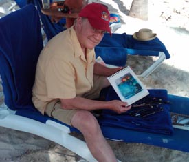
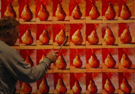
Life in the fast lane! There has been so much going on - we closed out the 2009 Workshop year with Jerry’s Artarama Art of the Carolinas in Raleigh - we always have a great time there! After four full days of teaching 290 students, we were ready for a little R&R on a beach in Mexico. I have included my Inktense Drawings (and a small review) I did while under a palapa on the beach!
January was hopping with workshops in Bonita Springs and Pensacola, Florida. February was full too - Austin at Wenmohs Ranch, Farmington, New Mexico and the Emerald Art Center in Oregon.
A few newsletters ago, I shared my experience with Citra-Solv as a tool for creating beautiful collage papers. I am happy to tell you that the Citra-Solv people have created a beautiful artists’ section on their website with samples, examples and how-tos! They have done a great job. Here is a link to their site: www.citra-solv.com/newcitraartist
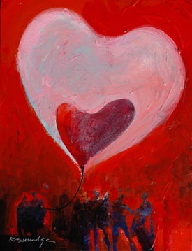
One more thing - Kim Ellery, an artist friend of mine has spearheaded a fundraiser for Haiti, an Art-a-thon. The live auction will be held at Jerry’s Artarama in Raleigh. We have donated a painting titled “Heart Air Balloons for Haiti” - contact Jerry’s for information and tickets! As usual, we have a lot going on - more international workshops, our 2010 Studio Mentor Workshop schedule and launching our new Painting of the Month Club! Read on and stay tuned! On Location with Bob
Inktense Pencils from Derwent Oh… mygosh, Inktense. The name says it all. These are no wimpy, pastelish, watercolor pencils. These are kick-butt color - okay? Everyday while sitting on the beach in Mexico, I made these paintings with only the pencils, a watercolor pad… and beer (uno mas por favor?) I had a great relaxing time, discovering these powerful, creamy, smooth, water-soluble color pencils. But wait, there’s more: They are permanent and cannot be lifted! Derwent Inktense pencils. They are available at Dickblick.com, Jerrysartarama.com or at your favorite local art supply store.
Studio Tip My watercolors on paper are displayed raw and not behind glass. I spray Lascaux Archival Spray Fixative on my watercolors. Follow the directions. I spray on several coats. It will not yellow. Afterwards I might even brush on a very light coat of water based poly acrylic varnish. I prefer the brushed on heavier final coat. And no, I don’t usually enter my watercolors in competitions anymore - I just wanted to eliminate the glass. There are many spray varnishes. My favorite happens to be Lascaux Archival Spray Fixative. I like the look! Check out Jerrysartarama.com, cheapjoes.com and dickblick.com to order. Product Spotlight
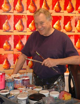
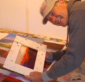
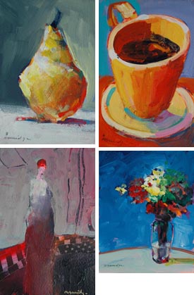
Bob was out the other week picking up wine from our local winery. We’re members of their “Club” which means we receive a case of their favorite handpicked wine every month. This gave Bob a new idea! How about “The Burridge Painting of the Month Club.” You get an original painting every month! He paints many original warmup paintings everyday, so we thought why not make them available to our friends first? Here’s the deal: When you join the Burridge Painting of the Month Club, you will begin receiving an original Burridge 6x9 inch painting (matted, with a foam board back and sleeve) every month!
Each painting is completely painted and hand-selected by Robert Burridge, signed and dated. Each month will be a different subject matter, including still lifes, abstract, landscapes, figures, etc. and represents what he is currently working on in his studio. Each month you can expect high quality paint on professional quality watercolor paper. 6x9 inch paintings matted on a 12x16 inch presentation.
These paintings currently sell for $150 each. But by joining this unique, one of a kind painting club for one year, you will receive an original painting every month for 12 months at only $75 for each month. That’s $900 plus shipping and handling.
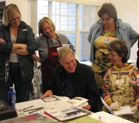
Twelve Month Painting of the Month Club Workshops in the Spotlight We are happy to announce a new workshop in Southern California! May 17-21, 2010 We will be teaching another Loosen Up Workshop this May at the Sedona Art Center! May 24-28, 2010 I have quite a few “Loosen Up” workshops scheduled this year! I call it my flagship workshop because it is a good jumping off point for loosening up your painting style, no matter what your subject or materials. My Loosen Up Workshop is technique-based rather than materials-based and we have a lot of fun doing many different assignments. Studio Mentor Workshops
2010 Burridge Studio Mentor Workshops •April 22-25, 2010 Three and a half days of Mentor Painting Contact Kate@robertburridge.com for costs, details and availability. For more of my workshops all over the county, check out my workshop schedule. Product Review
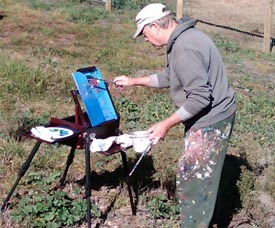
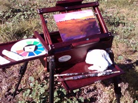
Oh no, not another easel! My friends, listen to me on this. You have read my earlier articles discrediting old design, wooden, dark ages, French-style easels still manufactured (poorly) even today in 2010! And you have also read my praise for the contemporary design and new technology of the $500 Soltek easel, which I take to all my plein aire workshops. I lean towards good, intelligent design and quality of craftsmanship. (I used to be an industrial designer for cryin’ out loud!) This week I was introduced to the latest of easel products. Wow is what I said when I took this magnificently crafted cherry wood easel out of the box. My first impression was… this is an easel? It feels and looks like a finely crafted piece of furniture and oh, by the way it folds out and telescopes into a beautiful piece of functional sculpture. All wood easels should wake up and look at the innovative design, secret pull out shelves and quality hardware.
The new, quick release, telescoping legs (no more tiny turn screws), quality craftsmanship and affordable price makes this new product my pick of the month. And I can paint either vertical or flat. More importantly, you’ll look and feel more professional! Great Trips! - International Workshops January 23-30, 2011 March 20-28, 2011
September 1-8, 2012 Ask Kate about Art Marketing
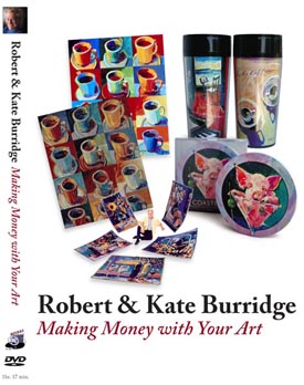
Jeanette from California asks: Really appreciate the question Jeanette! If it's for a juried show, and we expect the painting to be shipped back to us - we use an "Airfloat" box. Here's their website: http://www.airfloatsys.com When I have called them to order a box, they ask what size the painting is, then go from there. Great boxes - good to ship framed paintings as well as canvases. The art is safely encased in three layers of protection - two layers of convoluted foam and one layer of Perf-Pack foam. Provides the strength of plywood without the weight. If we are shipping to a gallery or a client, we will use a heavy duty "Mirror Box" - we purchase them from moving companies. Bob wraps the painting in plastic, then bubblewrap. Hope this helps! Shirley from California asks: Shirley, thanks for writing! We are firm believers in “exposure equals success.” You are going in the right direction and thank you for realizing that no one is going to find your website unless you tell everyone repeatedly that it’s up and running! In our area, all of our different arts associations and art centers have member groups and registry opportunities for artists’ pages on their sites. Our entertainment newspapers also have an artist registry. I am also a firm believer in social networking sites like Facebook and Twitter. I am careful to keep our Facebook and Twitter professionally slanted - I don’t put up too much personal information on Bob’s FB page. We also want, first and foremost, to encourage people to go on our website - so we put our website everywhere! On our email signature, business card, letterhead, and email address. If you have a website - use that as your email address - rburridge@robertburridge.com. Now you know we have a website! But if your email address is kittyycat@aol.com… It doesn’t really let potential customers know you have a website, if you are an artist, or if they have the right person! You want to communicate - easy, fast and perfectly clear! Best of luck to you - Marketing, Marketing, Marketing! Breaking News We are teaching 2-day Art Marketing Workshops in Palm Springs, California this April and a 1-day Art Marketing Workshop at Dillman’s in Wisconsin this August: April 10-11, 2010 August 23-27, 2010 Can’t get to a workshop? The next best thing - our new Art Marketing DVD!
In “Making Money with Your Art,” Robert and Kate Burridge candidly answer the top ten burning questions that artists have about selling their artwork. Some of the topics covered by the Burridge’s in the almost hour and a half DVD include, What is Marketing?; Photographing Your Art; Artists’ Bios, Statements and Websites; Pricing Your Artwork; Copyright and Licensing; and Galleries. For a list of my other favorite books and magazines about marketing your art click here.
I’m on Facebook! Recommended FB Fan Pages:
For Email Marketing you can trust
Click HERE for top of page. |
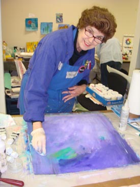
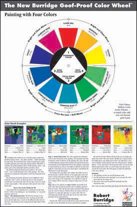
This continuing series spotlights successful color combinations using my Goof-Proof Color Wheel. This month’s step by step demo features Holbein’s Compose Blue #2 as the dominant color. You can substitute any blue that is close in hue. And that’s the point of my Goof-Proof Color Wheel - any color close to my color wheel will work. In fact, when the dominant pointer falls on blue - I pick out three different blue colors. If I’m out of any specific “Blue,” I choose any blue that’s close. As I say, “This isn’t rocket science - it’s just water and color.” My color wheel simply gets you started in a more successful direction early on. It works for me! • Compose Blue #2 is the Dominant color 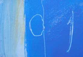 Compose Blue #2 is the Dominant Color Over All Step One: Bathe the canvas or paper with all kinds of wet, sloppy Blue color plus black and white. Make this step very playful and abstract. Pretend this will be your finished painting. Let dry. 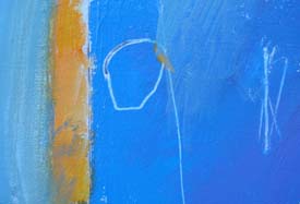 Adding the Focal Point Color and Spice Colors Step Two: On the spinning pointer, the second color on the color wheel will be the “Focal Point Color”. Everything else in the painting will support this color. This is the focal point - the place you want the viewer to see first. 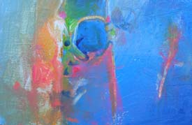 Spice Colors around the Focal Point Step Three: Two final colors I call “Spice Colors” only appear near and around the focal point color. As pure spice color around the pure focal point color the viewer’s attention is quickly drawn to the focal point. If you use any of these colors elsewhere in the painting you should “gray them down” so as not to draw too much attention to them… that is, away from the focal point.  Another Version of this Color Combo using the Burridge Color Wheel. I hope this series of my color combinations works out as a new inspirational start in your next series of paintings. Try them, copy them and then make them your own. You’ll be okay! For a detailed description of the Burridge Goof Proof Color Wheel, click here. I am often asked what other brands of paint will match my Color Wheel. For my Color Comparison Chart of Golden, Lascaux or Nova Colors, click here. Studio Tip I love sharp blades. Dull blades are dangerous. Since my graphic design days, I have been using X-acto #11 blades for precisely cutting my collage letters, sharpening my pencils, etc. I discard them after a few days. I do the same on those huge utility knife blades. So how should you discard the blades? Before I throw them away, wrap the blade in wide masking tape - both sides. The point is to protect those sharp edges from inadvertently cutting again. It’s much more safe when someone pushes down the trash with their hands. (I found out the hard way!) So wrap up those disposable blades! 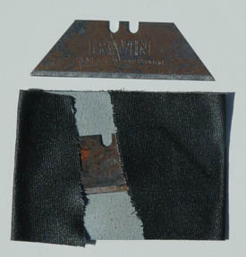 Disposing of Sharp Blades We Want to Hear from You!
Keep those Studio Tips coming everyone! If we use yours in an ArtsyFartsy Newsletter, we will send you a Burridge Permission Mug. From Sandra, North Carolina: I used Murphy's Oil Soap to soak up some acrylics from a couple of blouses it really worked great! BUT... what is even better? I soaked a bottle of Iridescent Medium upside down in some of the soap with it just covering the lid. This bottle I have had for over a year with the lid stuck so tight that I was afraid I would shatter the glass if I used real force on it. I kept it anyway thinking I would maybe break off the top and pore it into some other bottle but then I thought to put it in the soap... when I pulled it out of the soap, wiped it off, and tried the lid... violá!! It twisted off easier than a new jar!!! Thanks Sandra! For your Studio Tip, you get a Permission Mug! 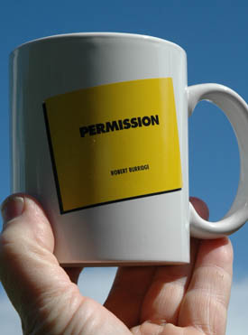 Permission Mug When Your Head is Exploding and You Don’t Know What to do Next… Burridge Quick Guide to Making a Goof Proof Painting 1. You’re here in front of your canvas because you want to paint. Be happy about it. 2. Attitude and Passion - Before jumping in with your passion, think about why you are painting this piece in the first place. Write it down. Write down your goal. Now, your head is clear, your goals are established, now passionately go after it. If you are hesitant or fearful at this point, you are already thinking about failure. Whoops!  3. Paint the way you have always wanted to paint. Paint your way. If you paint to copy another’s painting, you become another bad copyist and have denied yourself the chance to demonstrate to others who you are. A successful painter paints what they know and what they feel about a subject they love.  If you have no feeling about your painting, if you are ambiguous, you will struggle painting an ambiguous, unfeeling painting. Contemporary painters don’t separate themselves from their art. Paint who you are. It’s much more interesting for you and for the viewer. Oscar Wilde said, “Be yourself; everyone else is already taken.”  4. Decide on your equipment, your tools and your medium. Put away everything else. If the tools you have in your workspace do not serve you, put them away. Visual clutter around you may add to visual chaos. (But not always … Some artists, however naturally do well amongst chaos.) 5. Decide on your color combination and get out only those colors. Limit your colors, don’t overmix, mix some midtones (value of 5) of those colors and begin painting with midtones all over. Eventually you add the pure colors of lights (value of 1) and pure colors of darks (value of 10). 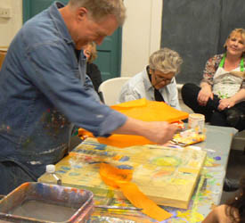 6. Decide on the focal point of the painting. Everything you do should lead the eye to the focal point. The reason or the thing that originally caught your eye to do the painting in the first place (the goal). 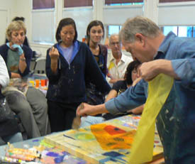 7. Paint extremely abstractly first - under every good painting is a good abstract painting. Also, abstraction around the periphery of the focal point nudges the eye to go to the point of focus. The point of the painting.  8. The focal point, remember, is the WOW… the reason you wanted to paint this in the first place. This is the most important part of the painting. 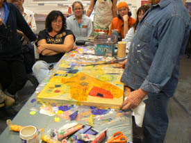 9. Stop too soon. If you overpaint a subject it becomes visually boring. Too much detail is a bore. Think about this, a painting is never finished… it just stops at an interesting place, usually at 90%. Do not give the viewer all the information, thereby inviting the viewer into your work. And here’s something to think about: It takes less than three seconds for the viewer to decide if they are interested in the painting. Try this yourself on your own work. 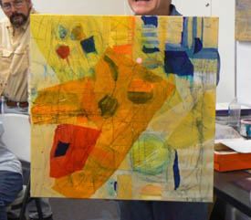 10. Finally, your painting experience should include what I call, the Four C’s. They are 1) Content (intention); 2) Color combinations 3) Composition design and 4) Commitment. Have the courage to follow your commitment for awhile (it was a good idea at one time). Follow through with your original idea, your original goal. Commit until the painting says, Stop!... then stop. Recommened Book
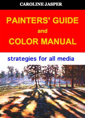
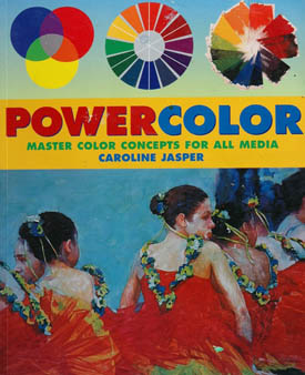
If you have already read her book Powercolor or taken her painting workshops, Caroline Jasper’s new book, Painters’ Guide and Color Manual is an excellent companion piece for further exploration of Caroline’s color theory. It works! Her explanations and colorful examples clearly illustrate her color strategies for all media. Watercolorists, Acrylic or Oil painters, this manual is for you. the facts are all there - no fluff - all facts! This textbook style guide is essential for the painter who seriously wants to move up to the next level of understanding how to paint their next masterpiece. Painters’ Guide and Color Manual - Strategies for all Media Caroline Jasper, artist, colorist, author and workshop instructor is represented by Art Source for Design Gallery in Scottsdale, Arizona. Gallery Hughes in Boca Grande, Florida, Art Access Gallery in Bexley, Ohio, The Gallery at Round Top in Round Top, Texas and Gallery Wright in Wilmington, Vermont. Her paintings are held in private, corporate and public collections internationally. She is author of the book, Powercolor - Master Color Concepts for All Media and a DVD, Color Moves - Painting Water with Oils.
Powercolor - Master Color Concepts for All Media Music of the Month
More music! My taste in music is rather eclectic. In my studio and during workshops I play many different styles - classical, world, jazz, lounge… This month I needed a strong dance beat to get me going! Those of you who have been in my workshops have probably heard some these. Enjoy!  Terra Firm Sounds from the Ground  Constant Pressure Beat Pharmacy Frequently Asked Questions this Year
Q - What’s the WOW factor? I hear you refer to it each time you look at any painting. 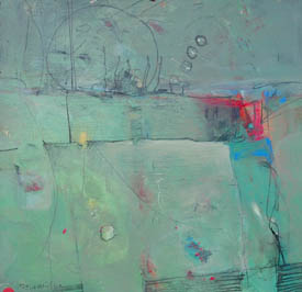 WOW Factor Example Q - Why is your Composition Chart necessary?  Cantilever Composition Q - Two paintings framed together is called a diptych. Three are called a triptych. What are more together called? “Women of the World” Polyptych
 Celebrating Thanksgiving in Mexico
Copyright ©2010 Robert Burridge. All rights reserved.
|
||||