 close window  Rembrandt-Style Lighting Technique
|
|
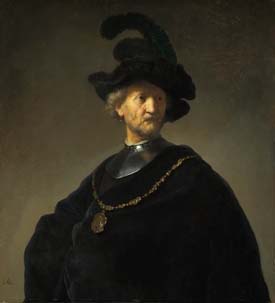
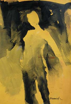
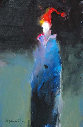
Staring at a Rembrandt painting awhile ago, I wondered what made his portraits so striking. Besides the obvious masterhand of rendering a likeness of the person, using limited palette of black, white and earthtones, it finally dawned on me. His dramatic use of strong graphic design and strong lighting. My eye went directly to the center of interest - the face - because it was the brightest section next to the darkest dark. (And how many years of painting did it take me to finally wake up?) So I made a sketch painting, emulating his theory and technique on an orange-toned paper, using only black acrylic paint:
• The background started black at the top and gradated down towards the bottom. • The figure was painted in the opposite direction. The bottom of the legs started out as the blackest black and gradated lighter as I moved up to the lightest part of the face.
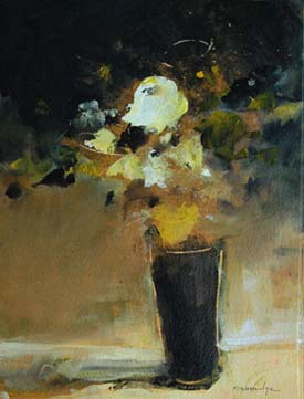
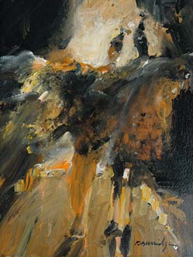
I began an entire series like this … I experimented with different human forms, floral still lifes and even free abstract paintings. I practiced this simple concept over and over again with black and white warmups - then I switched over to a color palette, using this same technique. I’m hooked!
Many of my recent works, whether recognizable subjects or experimental abstracts continue with my recent “discovery.” In my workshops I invite the painters to copy this figure and paint a series of six. Their excitement of discovery prompted me to write this article and suggest you try the same exercise. Practicing this multiple series over and over again could help you produce more favorable and dramatic results. Practice, Practice, Practice! Even Arnold Palmer once said, “The more I practice, the luckier I get.” He continued on with this observation: “The days I don’t practice, the behinder I get.” I know the feeling. |

Copyright ©2007 Robert Burridge. All rights reserved.
If you wish to copy this material to other publications
or mail lists, please ask for permission by contacting:
Robert Burridge Studio
Arroyo Grande, California
805-459-1503
rburridge@robertburridge.com
www.robertburridge.com
close window